Want to see things change overtime? You can!
Visualizing Time Series Data. A short Introduction.
What is Time Series Data?
Time series data sets refers to data that has observations on a variable or many variables over time. ‘Time’ is an important dimension in time series data and is best understood using data visualizations. Here, the chronological ordering of observations conveys important information. Another feature of time series data, that can require special attention is the data frequency at which the data are collected, i.e., daily, weekly, monthly, quarterly, annually. Visualizing can be an efficient way to view the data for trends and patterns. Many weekly, monthly and quarterly time series data display strong seasonal pattern, which can be an important factor in a time series analysis.
Time Series Data Visualization
This blog should give you a start in visualizing time series data using various data viz packages and connect you to resources along the way, to help further your understanding.
Getting the Data: For simplicity, the example below uses real world data. Here I used the US Unemployment rate data available at the St Louis Federal Reserve website. Once downloaded and read as a pandas dataframe, this is what the first 5 observations looked like and info on the dataframe.


Be sure to take care of the DATE or your time feature. Notice that it is currently stored as an object dtype. This needs to be converted to a datetime object and set as the index for the dataframe.
#converting the DATE column to a datetime object and specifying the date format
unemp[‘DATE’]= pd.to_datetime(unemp[‘DATE’], format=’%Y/%m/%d’)#setting the DATE column as index
unemp.set_index(‘DATE’, inplace=True)
More information on the pandas to_datetime() function can be found here When specifying the format be mindful of how your date is presented in the data, to state the correct format. For time format reference go here or here.
#reading the dataframe index
unemp.indexThis is the output I got
OUTPUT:
DatetimeIndex(['1948-01-01','1948-02-01','1948-03-01','1948-04-01',
               '1948-05-01','1948-06-01','1948-07-01','1948-08-01',
               '1948-09-01','1948-10-01',
               ...
               '2020-01-01','2020-02-01','2020-03-01','2020-04-01',
               '2020-05-01','2020-06-01','2020-07-01','2020-08-01',
               '2020-09-01', '2020-10-01'],
              dtype='datetime64[ns]', name='DATE', length=874, freq=None)
We are now ready to try out some visualizations
Matploblib (lineplot and dotplot)
#defining the figure and axes
fig, ax = plt.subplots(figsize=(20,8))#calculating average for avg line
avg = y_mean = [np.mean(unemp['UNRATE']) for i in unemp['UNRATE']]#defining the x and y axis to use for the plots
x = unemp.index
y = unemp['UNRATE']#Plotting the graph using unemp data and adding avg line
ax.plot(x, y, label = 'UNRATE')
ax.plot(x, avg, label = 'avg UNRATE', linestyle= '--')#legend location
ax.legend(loc='upper right')#plot title
ax.set_title('US Unemployment rate trend between 1948 to Oct of 2020', fontsize= 25 )#plot axis labels
ax.set_xlabel('Date', fontsize= 15)
ax.set_ylabel('Unemployment rate', fontsize=15)#saving figure
plt.savefig('US_unemployment_line_plt.png')plt.show();

You can see here that the data does not have a constant mean and violates the stationarity assumption. There is a fair amount of volatility in the US unemployment rate even in the last 20 years with peaks in 1992, 2003, 2010 and then in April of 2020, and then a steep drop from there on.
You can create a similar lineplot with seaborn, by replacing ax.plot(x,y,label='UNRATE')with sns.lineplot(x=unemp.index, y = ‘UNRATE, data=unemp)
#similar lines of code follow here with the only difference of the #stated style parameter of 'b.'unemp.plot(figsize=(25,8), style= 'b.')
plt.title('US Unemployment rate trend between 1948 to Oct of 2020', fontsize= 25 )
plt.xlabel('Date', fontsize= 15)
plt.ylabel('Unemployment rate', fontsize=15)
plt.savefig('US_unemployment_dot_plt.png')
plt.show();## Disclaimer: Always mark your comments for your codes

A dotplot like this displays the scatter of the data and allows a better view of any outliers.
PLOTLY
For more information on Time Series visualization using plotly visit this link. For now let’s attempt a simple line plot using plotly.
#Import plotly express library
import plotly.express as px#define figure and draw lineplot
fig = px.line(unemp, x=unemp.index, y="UNRATE", title='US Unemployment rate trend between 1948 to Oct of 2020')

#save figure
fig.write_html("Unemp_plotly.html")fig.show();

Plotly allows for a more interactive experience with your plots. The image above shows you what happens when you hover your cursor/mouse over the plot line. You can also zoom in or out on sections of the plots using the buttons on the top right of the plot.
A good article on use of plotly for timeseries data is ‘Introduction to Interactive Time Series Visualizations with Plotly in Python’.
Attention to data frequency- Using the pandas Grouper() function to group data frequencies. This link should lead you to the documentation site for the function. To state what time frequency you want, you will need to use the offset alias, you can use this link for a list of aliases for time series frequencies.
You can also try the pandasresample() method, which is unique to time series data, to either upsample your data from a low frequency to higher frequency (month to year, or minute to hour) or downsample your data from a high frequency to a low frequency (month to weekly, hour to seconds). To use the resample() method, your datetime column must be specified as the index of your dataframe.
Here we’ll group our data by the year where each column will be a particular year and each row will be months where the cell will give the unemployment rate for that year(column) and month(row).
# Use pandas grouper to group values using annual frequency
year_unemp = unemp.groupby(pd.Grouper(freq= 'A'))#returns a groupby object
year_unemp
pndas.core.groupby.generic.DataFrameGroupBy object at 0x7fe5b42f1fd0
I used next(iter(year_unemp)) to try to get an idea of what was inside year_unemp.

It returned the first iteration output, where it looks like the data is grouped by year.
# Create a new DataFrame and store yearly values in columns
annual_unemp = pd.DataFrame()#looping throup the year_unemp groupby object as a tuple
for date,group in year_unemp:
    year = date.year          #pulling the year from datetime object
    if year == 2020:
        break
    series = group.values.ravel()  # flattening the array
    annual_unemp[year] = series

annual_unemp.head()
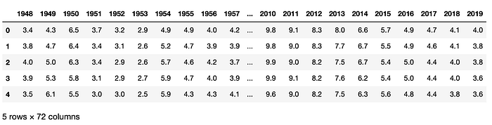
I removed the 2020 data from here, since it is still missing values for the last two months. Feel free to try some special codes where it pulls into the dataframe but fills the empty cells with 0s (if you succeed, let me know). At this point let’s say I am only interested in looking at the last 10 years trend. So the next few visualizations will focus on a separate dataframe with data on just the last 10 years (excluding this year 2020).
last_10years_list =[range(2010,2020)]
last_10years= annual_unemp[last_10years_list]
Using the simple pandas.DataFrame.plot we can create subplots by year. To see all parameters, you can visit the documentation site.
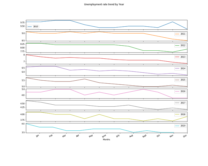
# Plot the yearly groups as subplots
last_10years.plot(figsize=(15,12), subplots= True, legend=True,
                           title='Unemployment rate trend by Year')plt.xlabel('Months')
plt.ylabel('Unemployment Rate')plt.xticks(ticks = range(1,13), labels= ['Jan', 'Feb', 'Mar', 'Apr', 'May', 'June', 'July', 'Aug','Sept', 'Oct', 'Nov', 'Dec'])plt.savefig('last_10year.png')
plt.show();
Also using plotly.express you can view the trends for each on the same figure, when you pass the dataframe columns (years) to be measured along the y-axis.
fig = px.line(last_10years, x=range(1,13), y=last_10years.columns,
              title='Unemployment Rate 2010 to 2019',
              labels = {'x':'Month', 'value': 'Unemployment rate'})fig.write_html("Unemp_plotly_last10years.html")
fig.show()

Again on a plotly plot, if you hover your cursor or mouse over the plotline you can view the data plotted at that point on the graph, as shown in the plotly plot image above.
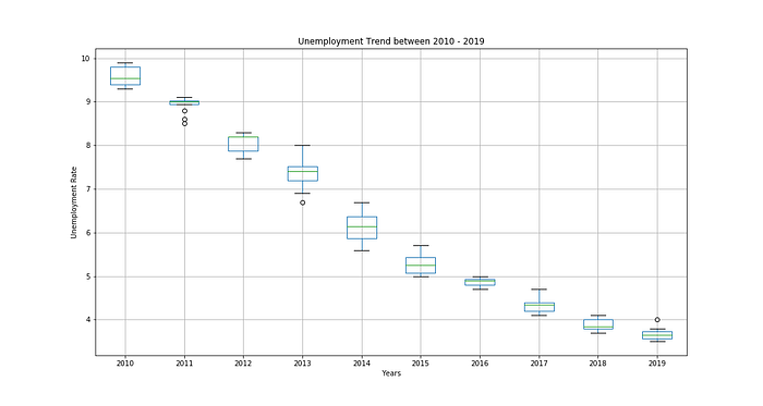
Another useful way to view trends over time is plotting boxplots. Again using the simple pandas.DataFrame.boxplot() , on the dataframe with the unemployment rate for the last 10 years
# Generate a box and whiskers plot for last 10 years
last_10years.boxplot(figsize=(15,8))plt.title('Unemployment Trend between 2010 - 2019')
plt.xlabel('Years')
plt.ylabel('Unemployment Rate')plt.savefig('last_10year_boxplot.png')
plt.show();## Disclaimer: Always mark your comments for your codes
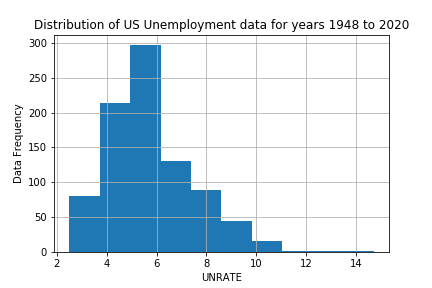
Visualizing the distribution of time series data
# Plot a histogram
plt.hist(x='UNRATE', data=unemp, bins= 10)
plt.grid(True)plt.title('Distribution of US Unemployment data for years 1948 to 2020')
plt.xlabel('UNRATE')
plt.ylabel('Data Frequency')plt.savefig('Unemployment_hist.png')
plt.show();
# Plot a density plot
unemp.plot(kind='kde', figsize=(10,5))plt.xlabel('UNRATE')
plt.title('Density Plot')plt.savefig('Unemployment_kde.png')
plt.show();# Plot density plot for the last 10 years
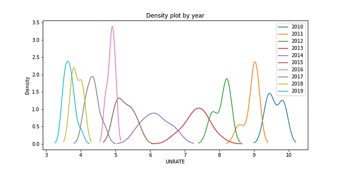
last_10years.plot(kind='kde', figsize=(10,5))plt.title('Density plot by year')
plt.xlabel('UNRATE')plt.savefig('Unemployment_kde_by_year.png')
plt.show();

Finally adding a HEATMAP, another way to view data trend over two dimensions. Here, we view the data changing from month to month and year to year.
I used seaborn to create the heatmap here but you can also use the matplotlib plt.matshow(). For this example, the code could look like this plt.matshow(annual_unemp,interpolation=None,aspect=’auto’, cmap= plt.cm.Spectral_r) instead of the sns.heatmap() line of code.
# Draw a heatmap with the numeric values in each cell
f, ax = plt.subplots(figsize=(20, 5))sns.heatmap(annual_unemp, ax=ax, cmap= plt.cm.Spectral_r)ax.set_xlabel('Year')
ax.set_ylabel('Months')
ax.set_yticklabels(['Jan', 'Feb', 'Mar', 'Apr', 'May', 'June', 'July', 'Aug', 'Sept', 'Oct', 'Nov', 'Dec'],
                  rotation= 'horizontal')plt.savefig('Annual Unemployment rate Heatmap')
plt.show();

In this blog you have been introduced to visualizing time series data by plotting
- Histograms and Density Plots: to view data distribution
- Lineplots and Dotplots: to view seasonality, stationarity and to lookout for outliers
- Box and Whisker plots: to view data trends over time (year to year)
- Heatmaps: to view data trends across month and year
